Choosing the Right Font for Memes
Start with where the caption goes. Short text over a photo may need a heavier font and outline. A sentence above the image can use a plain font on a solid header.

What’s the best font for memes?
For a short caption over an image, try a heavy, condensed font such as Impact. For a sentence in a separate header, start with a plain sans serif such as Arial. The useful choice is the one you can read at the size you plan to share.
Font family is one part of that check. Caption length, size, placement and contrast also matter.
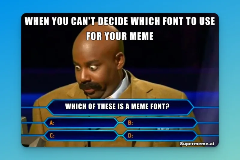
Choose a caption treatment
Use these as starting points. You can change the font if the words need more space or a different tone.
Text over the image
- Fonts to try
- Impact or Anton for a heavy, condensed treatment. They are separate typefaces.
- What to check
- Keep the caption short. Check the outline against both light and dark parts of the photo.
A separate header
- Fonts to try
- Arial or Inter for a plain sans-serif treatment.
- What to check
- Give the sentence enough room on a solid panel. Keep existing image dialogue readable.
Subtitle-style text
- Fonts to try
- A plain sans serif, such as Arial or Roboto.
- What to check
- Place the text where a subtitle would sit. Keep it clear of faces and existing captions.
| Caption treatment | Fonts to try | What to check |
|---|---|---|
| Text over the image | Impact or Anton for a heavy, condensed treatment. They are separate typefaces. | Keep the caption short. Check the outline against both light and dark parts of the photo. |
| A separate header | Arial or Inter for a plain sans-serif treatment. | Give the sentence enough room on a solid panel. Keep existing image dialogue readable. |
| Subtitle-style text | A plain sans serif, such as Arial or Roboto. | Place the text where a subtitle would sit. Keep it clear of faces and existing captions. |
Comic Sans MS can suit a deliberately informal caption. It does not require lowercase. Choose the treatment for the joke, then check the actual lettering.
Font names are not interchangeable
Impact and Anton are distinct fonts. Supermeme’s “Impact (classic meme font)” option uses Anton on mobile and Impact where available on desktop. Check the downloaded image if the exact lettering matters.
Microsoft’s Impact reference · Google Fonts: Anton
Arial Black is a heavier face in the Arial family, not the regular Arial option. Helvetica is another typeface. Supermeme’s font menu has an Arial choice; it does not list separate Arial Black or Helvetica choices.
Microsoft’s Arial Black reference · Microsoft’s Arial reference
Why font size and placement matter
A caption that covers the expression can hide the joke. A long sentence can also shrink until it is difficult to read. Shorten the wording before trying to squeeze it into the same space.
Choose the casing deliberately
Sentence case is a useful starting point for a full sentence. ALL CAPS can suit a short, bold caption. Lowercase can give a casual treatment. None of these is required by the font.
Sentence case: “One more notification.” Uppercase: “ONE MORE NOTIFICATION.” Lowercase: “one more notification.”
Title case capitalizes the main words of a heading. Camel case joins words without spaces, as in oneMoreNotification; it is more useful for a coding joke than a normal sentence.
MDN’s camel case definitionCheck text fill and outline separately
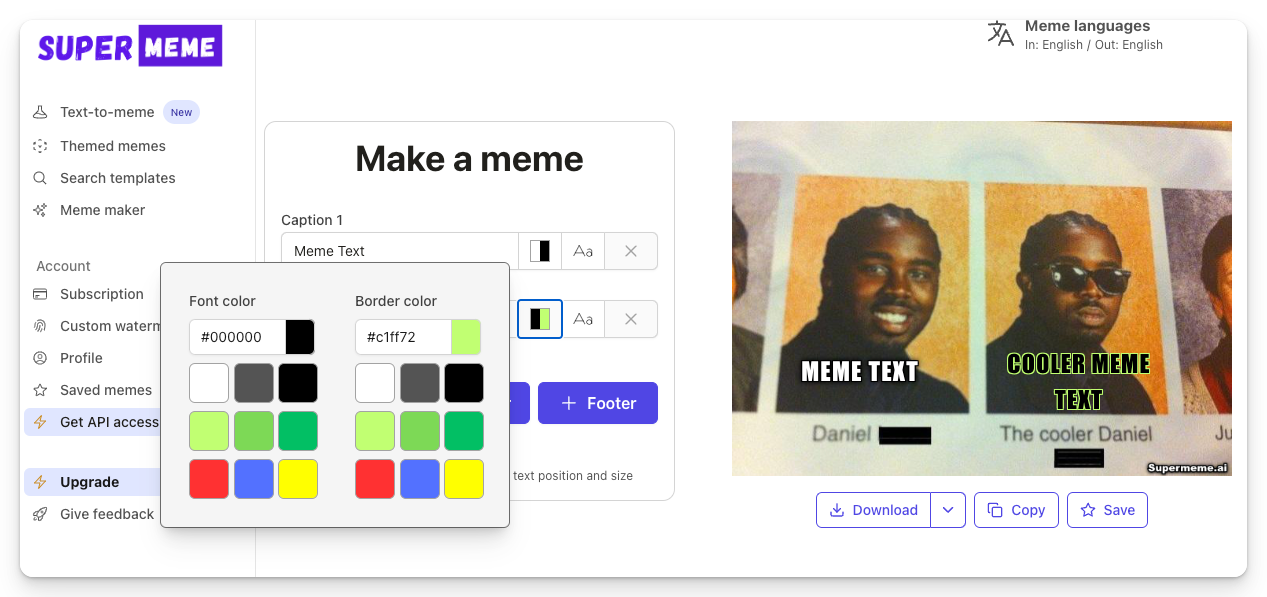
Font colour fills the letters; border colour sets their outline. White fill with a black outline is a useful starting point over a photo, but it still needs a check. Move the text or use a solid header if parts of the caption disappear.
W3C’s contrast guidance considers the background immediately behind the letters. An outline or contrasting backing can help separate text from a varied image.
Read W3C’s contrast guidance · See the outline and halo technique
Three caption layouts
Examples from the earlier guide show how an outlined caption, a separate header and subtitle-style text use different parts of an image.
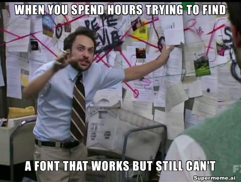
Over-image captions: Impact and Anton
The white capitals sit directly on the conspiracy-board image. Their black outline separates the lettering from some of the papers and dark areas. This is the kind of treatment you might try with a heavy, condensed font.
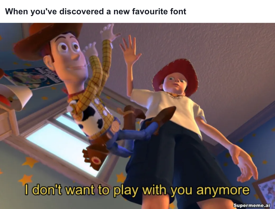
Header text: Helvetica and Arial
The new situation sits in a white header: “When you’ve discovered a new favourite font.” The scene already has the subtitle “I don’t want to play with you anymore.” A separate header gives the new sentence room without covering that dialogue.
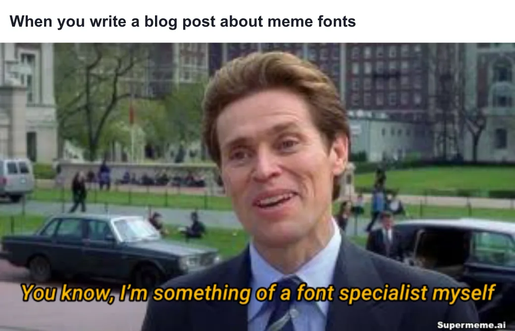
Subtitle-style text and Roboto
The header supplies the situation, while the yellow italic line rewrites the dialogue: “You know, I’m something of a font specialist myself.” The position and treatment make the line resemble a subtitle. Yellow and italics are choices in this example, not rules for subtitle memes.
Earlier editor screenshots
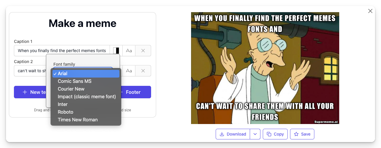
The font-family menu and colour picker show how font, text fill and outline are separate choices.
Adjust a caption in the meme maker
Start with a blank template or your own image. Text already baked into an uploaded image cannot be selected as an editable caption.
Choose the caption
Type in a Caption field or select the text you added. Shorten it if it covers the reaction or wraps into an awkward extra line.
Open font settings
Use Open font settings, then choose Font Family and Font Size. The menu lists Arial, Comic Sans MS, Courier New, Impact (classic meme font), Inter, Roboto and Times New Roman.
Check colour and placement
Use Open color picker to change Font Color and Border Color. Drag or resize added text to keep it clear of faces and existing captions. For a longer sentence, consider a header instead of more text over the photo.
Download and review
Download the image and open the file. On mobile, use Actions, then Share; your browser may download it instead. Check the words at the size you will post them, rather than only in the large editor preview.
What to fix when a caption is hard to read
The caption is too small
Cut words before reducing the size again. Leave enough of the image visible to understand the reaction.
Letters disappear into the photo
Try a contrasting fill and outline, move the caption to a quieter area or put it in a solid header. Check the whole line.
The caption covers another caption
Keep existing dialogue separate from your new text. A header can carry the situation while the image carries the response.
The image does not fit the joke
Changing fonts will not explain a mismatched reaction. Choose a format whose meaning fits the caption.
Match the template to the joke
Read the caption and look at the image together. Then open the downloaded file at the size you plan to share.
Written by
Sanjeev NCCo-founder of Supermeme.ai. Building the default meme generator of the internet since 2022.